A packing design can be strange, cool, creative, unusual or uncommon, but it just should be unique. Even a product is not superior than its opponents, it can still sell itself with a artistic design. Let us have a look at this selection and enjoy this creative assortment, feel free to share your thoughts with us via comment section below. Your comments are always more than welcome. Enjoy!
See also:
- 40 Packaging Design For Inspiration
- 20+ Premium Food based WordPress Themes
- High Quality Food Icon Design Inspiration
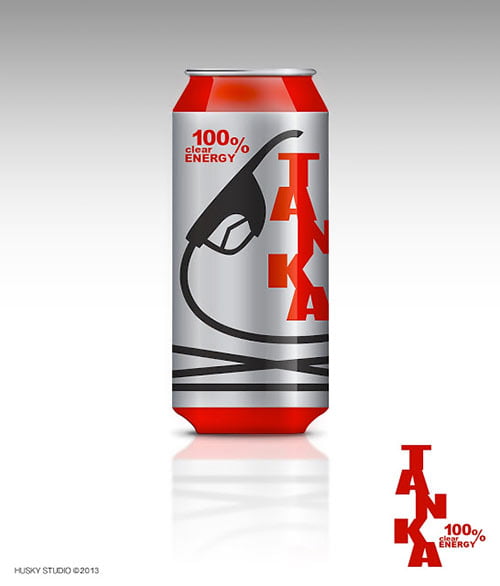
TANKA Energy Drink Concept
TANKA is a concept of energy drink. It’s a swedish word that means “refuel”. When your energy level is low, just refuel! TANKA!
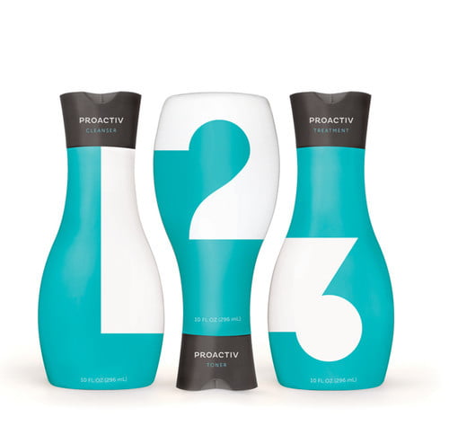
Proactiv Packaging
A gender-neutral packaging redesign for Proactiv Solution, an acne treatment system. The new bottles were designed to appeal to teenagers—Proactiv’s target market—by utilizing the more sophisticated look of a beauty product in place of its current “medical” appearance. The minimalist design highlights Proactiv’s very simple 3-step process, and the geometric, interlocking numbers suggest that each step is akin to a puzzle piece; integral to the completion and efficacy of the system.
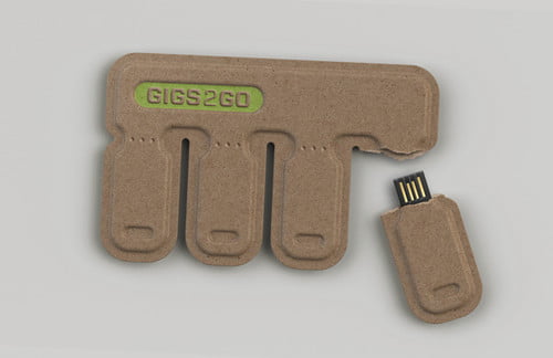
GIGS.2.GO
GIGS.2.GO is a credit-card-sized pack of USB flash drives, with “Tear-and -Share” technology. Simply tear off a tab when you need to quickly share files on-the-go.
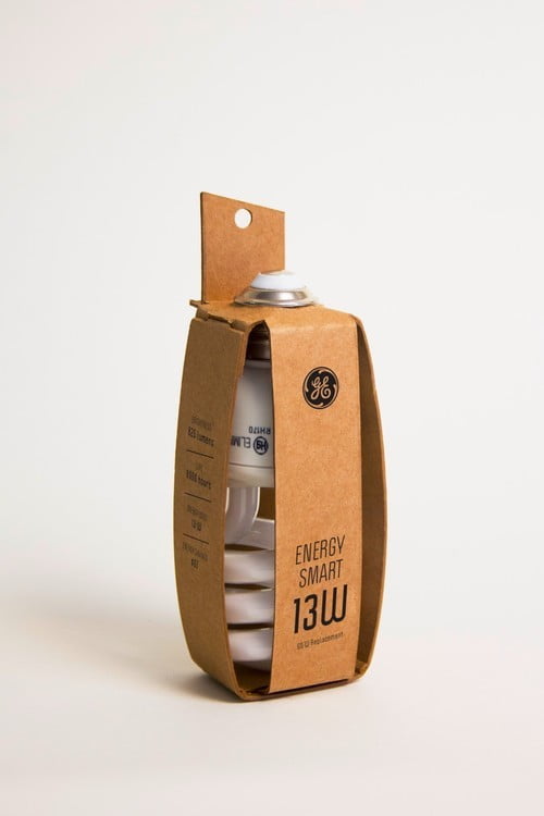
Enviornmentally-Friendly Lightbulb Packaging
This is an eco-friendly light bulb packaging for a single GE Energy Smart light bulb. It is constructed from a single sheet of recycled chipboard using no glue and minimal ink. The idea was to find a way to use the least amount of material while still offering protection.
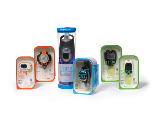
Sportline Sports Supply
Sportline sells sporting goods that monitor a healthy life style; some products include: heart rate monitor, pedometer, and stop watch. The current Sportline brands attracted a lightly more mature crowd with an average age of 50 years old. The challenge is to refresh the brand image and attract a younger audience. Furthermore, the current way of categorizing the products is confusing to the users. Besides bringing a fresher look to the brand identity and the packaging, a new product categorization was introduced to the audience.
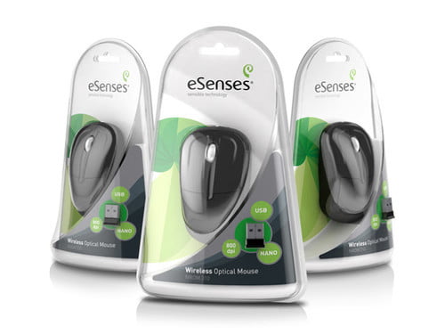
eSenses
Tridimage task was to create the brand and 3D package design identity for a Latin American PC Accessories brand. As a symbol of nature’s perfection and evolution, Tridimage found inspiration in the Nautilus to create eSenses structural and graphic packaging identity. The clamshells’ structural design is based on the Nautilus’ geometric progression whilst the graphics and brand logo reinforce the core concept.
Windfall
Windfall is an aromatherapy skincare line created by a group of earthy, tree-hugging health-nuts who believe that the most effective and luxurious solutions for your body and mind are born of nature’s simplest gifts. Thus they borrowed the freshest ingredients from Mother Nature, combined them with the most crisp herbal fragrances, and packaged them in an eco-friendly pyramid designed exclusively for beautiful young women.

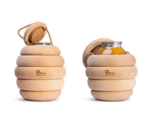
Bzzz Honey
The most tasty honey is in the beehive. But it is impossible to buy it in a market – it was impossible. Designers of Backbone Studio have made it out of wood and hid the can with honey into the improvised beehive. Simple but simultaneously original wooden wrapper is the message to the nature, ecology and pure taste. You immediately want to open and taste it. And there are no bees.
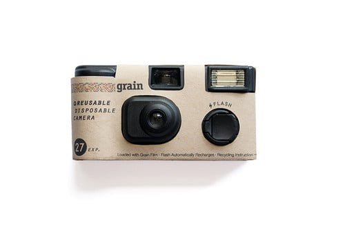
Grain
‘Grain’ is a reusable-disposable film camera and film brand. The dots on the film package represent weather it is color or b/w and the size varies according to the film ISO. Reusing instruction guide is included on the back of the camera.
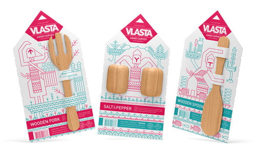
Vlasta Kitchenware
The brand name comes from ancient female name which literally means “domination”.
Flower Garden
Packaging for flowers helps in a quick and convenient way to transport the flowers without prejudice to their natural structure. The project is made from one piece of corrugated cardboard, which by proper bending becomes a stable structure likely to transmit various types of flowers. Packaging can be used as outdoor advertising for florists.

Ugmonk 4th Anniversary
To celebrate 4 years of Ugmonk we created a special Limited Edition 4th Anniversary Set featuring a custom designed number 4. There are only 200 of these sets ever made. The 4th Anniversary Tee features a soft water-based print on black 100% ringspun cotton tee and is carefully packaged in a custom flexible birch wood cylinder that is laser-engraved with the 4th anniversary seal.

De Fold Containers
This project rises from the need to provide a solution to the problem of plastic pollution that is currently increasing and gradually invading the ocean. From there, it was developed the collection of containers for various areas of food, currently packaged in some way with plastic elements.

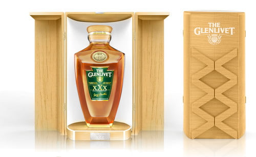
The Glenlivet Packaging 30 Years (Redesigned)
The design of this special edition redesign the shapes of the original bottle by play up some lines. The bottle is smaller and larger, it incorporates the codes of the cognac with a special cap made in precious wood and metals.
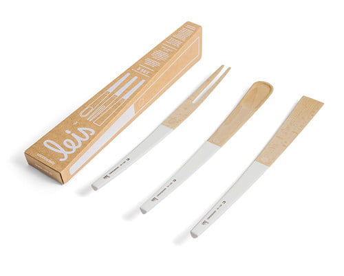
Leis
Leis aims to revive the centuries’ old woodcraft tradition called ‘suha roba’, born in Slovenia amidst one of Europe’s most forested areas. Combining contemporary design and long-established hand-crafting skills, the brand’s purpose is to manufacture appealing, user-friendly and well-designed products made strictly using locally sourced beech.
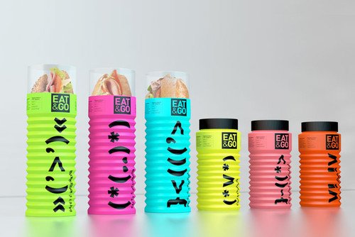
Eat & Go
Packaging is a plastic tube which is constructed as bellows and could be easily folded down decreasing the length of the tube (like bending section of a drinking straw).
Oregano Systems Shipping Box
The Oregano-Box is an elegantly styled and simple alternative to common packaging’s for electronic components. This packaging combines visual claims with great protection.

Delhaize Soup
The romantic image of the waiter’s hands gives positive connotations of good service and quality. The steady black and white photography helps to visually unify the whole range, which is complimented by use of simple bold typography to balance the design.

Shake it up!
“Shake it up” is a package of smoothie, fruits grains. The naming of ‘Shake it up’ means mix five grain powders and one fruit powder with milk or soy milk. There are six angles of this products. Inside it, there are six pieces of sliced fruits; five of them are made of five different kinds of grain powders, and the other one is made of fruits powder.

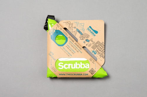
Scrubba Wash Bag Packaging
The Scrubba wash bag is the world’s smallest washing machine™ and allows travellers to clean their clothes anywhere and anytime for free. Lightweight and compact, the Scrubba™ wash bag requires no power or electricity.
Vivaclam
This package was designed in a concept of “Beat Your Heart”. Feature of sound vibration is formularized as a symbolizing graphic that conducted by sound wave and equalizer. This form of package reflects an idea of a trapezoidal profile of sound in a simple way.
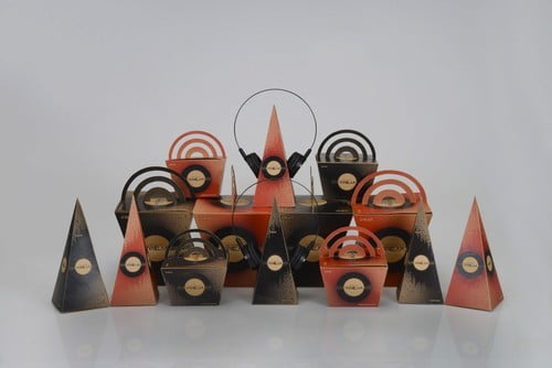
Korea Traditional Accesary Package Design
As the foreign visitors to Korea are remarkably increasing nowadays, this box package is made for them as one of many ways to learn about Korean culture. It is composed of fashion items among all other beautiful traditional accessories in Korea and each box is specifically designed for each item.
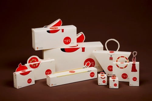
Carolin Bostrom
Diamond is a concept collection of beauty and health care products. These packages are made to show how much you actually can do when you challenge the material.This project was made for the recreate packaging competition that Stora Enso and the Alto University hosted.
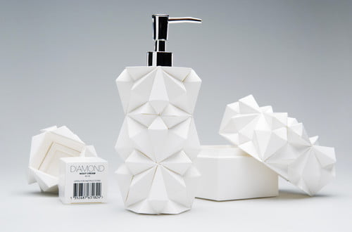
Purina SmartBlend Dog Food Redesigned
This packaging was the result of a comprehensive rebrand of Purina’s SmartBlend dog food. Our team focused on elevating the packaging in three key areas.
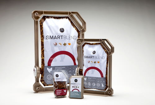
Mister Imagine’s Toy Store
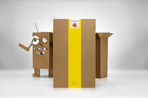
Mister Imagine’s Toy Store was an idea conceived in an effort to raise awareness of Chicago Children’s Museum Unboxed: Adventures in Cardboard, an exhibit featuring nothing but – you guessed it! – cardboard. Instead of real toys, Mister Imagine’s was stocked with boxes. Which meant if kids wanted a robot or a dollhouse, they were going to need their imagination.
